All 58 photos are prepared in 5 sizes and 2 modern formats, so each phone downloads only what it needs.
What we did
- Every photo in the right size. Each of the 58 photos is saved in up to 5 widths and 2 modern formats — 449 files in total. A phone downloads the small one, a large screen the large one.
- A soft preview while loading. A blurred thumbnail shows first, so the page never flashes empty boxes, and the page does not jump as photos arrive.
- Mount photos cleaned up: re-centred, background whitened, trimmed to fit their card on a phone.
- Videos load only when asked. The short job videos show a still picture until someone taps play; then our own simple player takes over.
- A photo viewer: tap a photo in the gallery to see it large, with arrows and a counter.
| Measured at launch | Old site | New site |
|---|---|---|
| Home page size | 5.2 MB | 1.5 MB |
| Loaded before the main content appears | — | 426 KB |
| Photo files prepared | — | 449 (58 photos × sizes × formats) |
One photo ──▶ 640 · 828 · 1080 · 1200 · 1920 px  ×  AVIF + WebP
                 │
   phone ◀── 640 px    laptop ◀── 1200 px    big screen ◀── 1920 px
How it looks
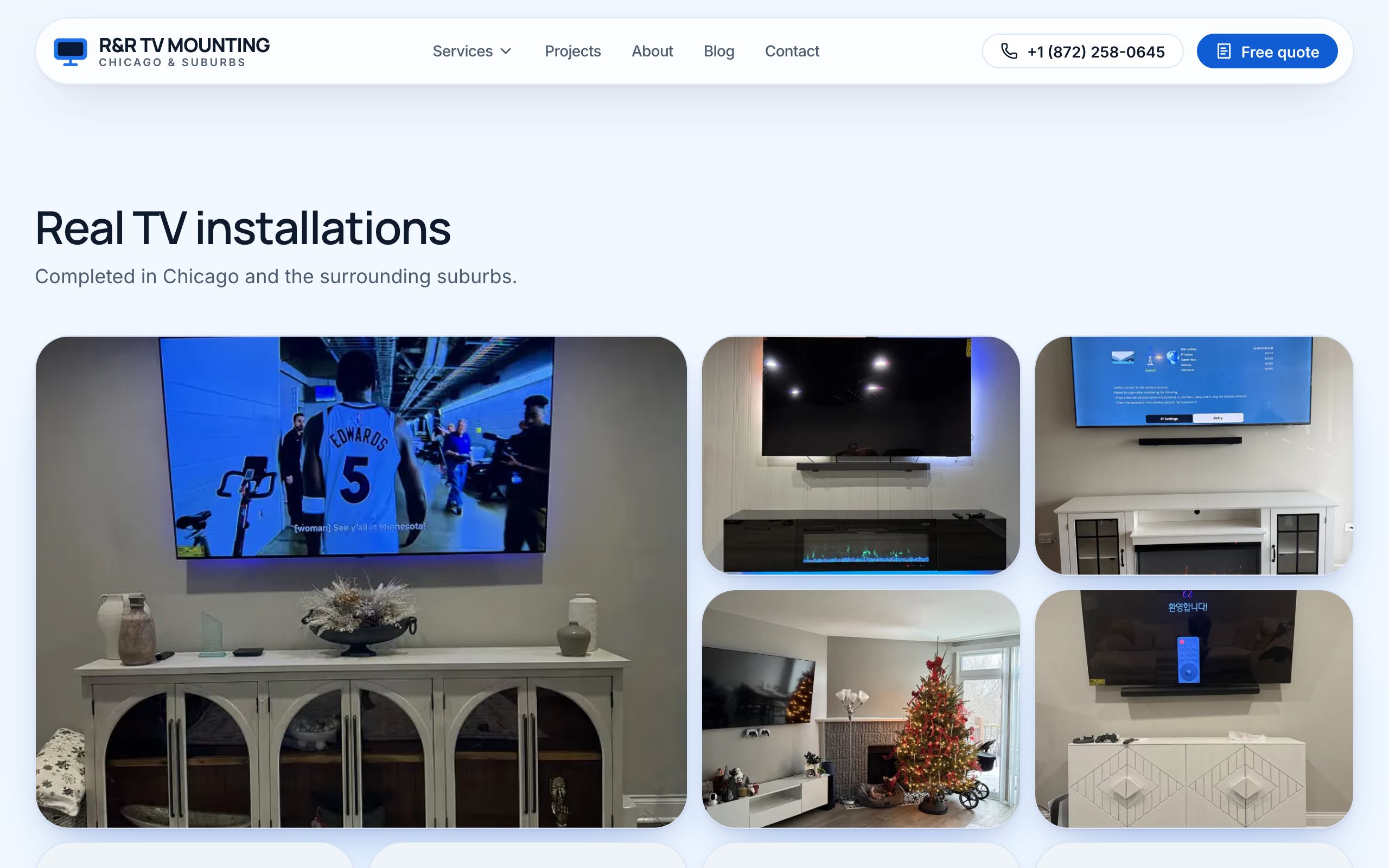
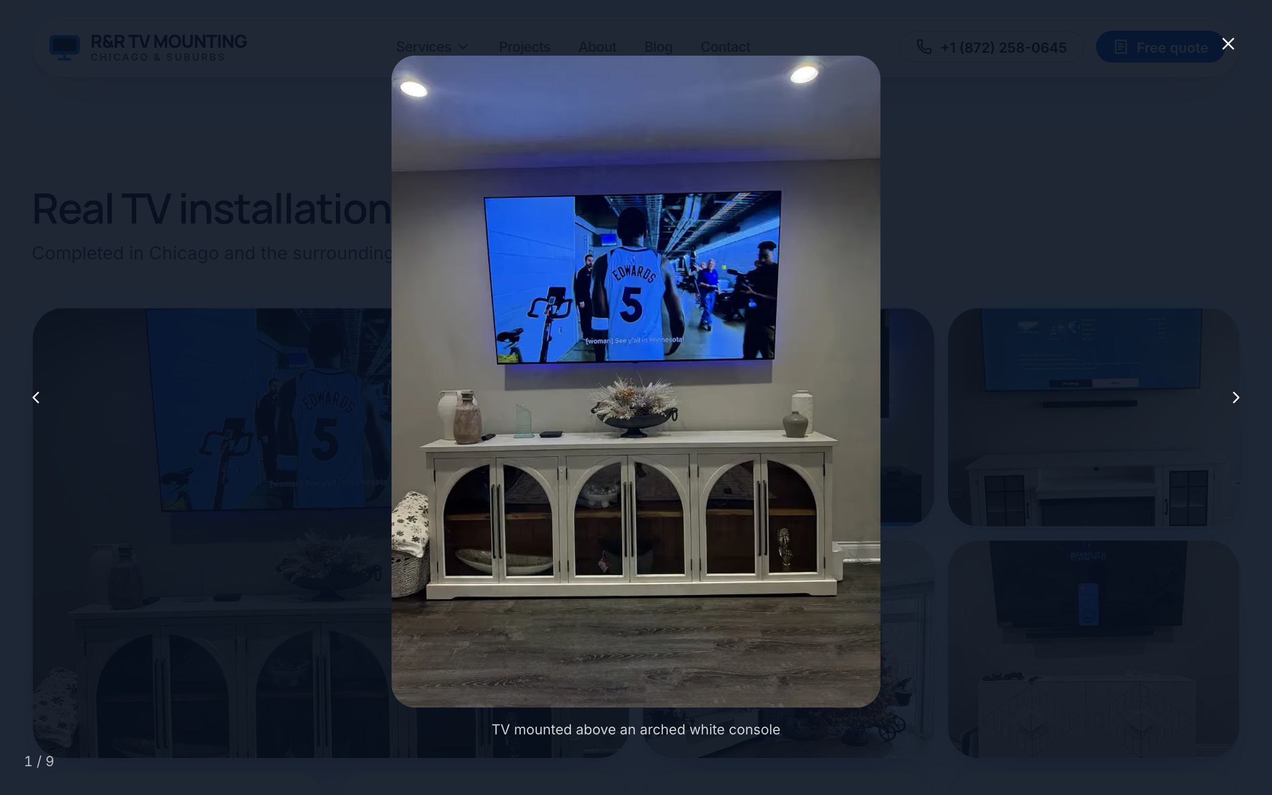
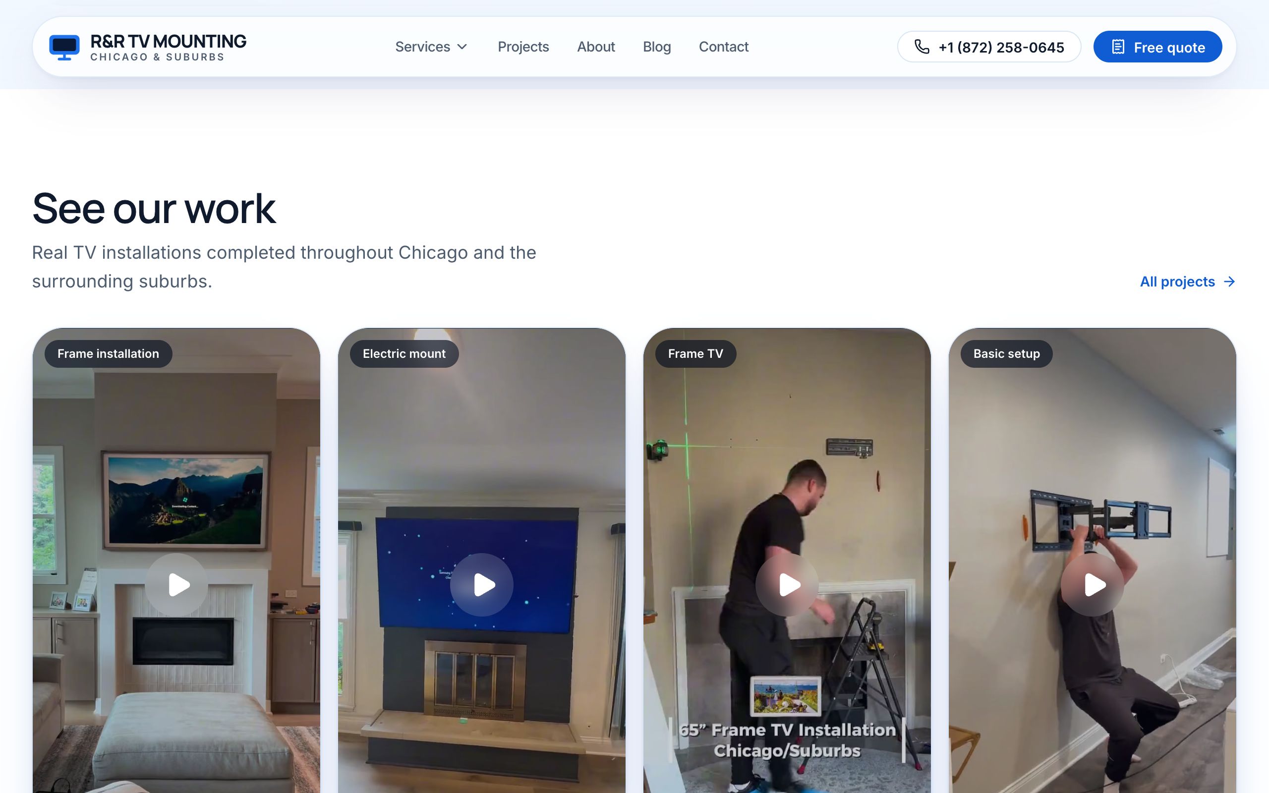
Why it matters
Most of your customers look at the site on a phone, often on mobile data. A lighter page opens faster — and a faster page loses fewer visitors.