ObserviX × R&R TV Mounting
The design system: colours, fonts, buttons and cards
DoneBuilding the website
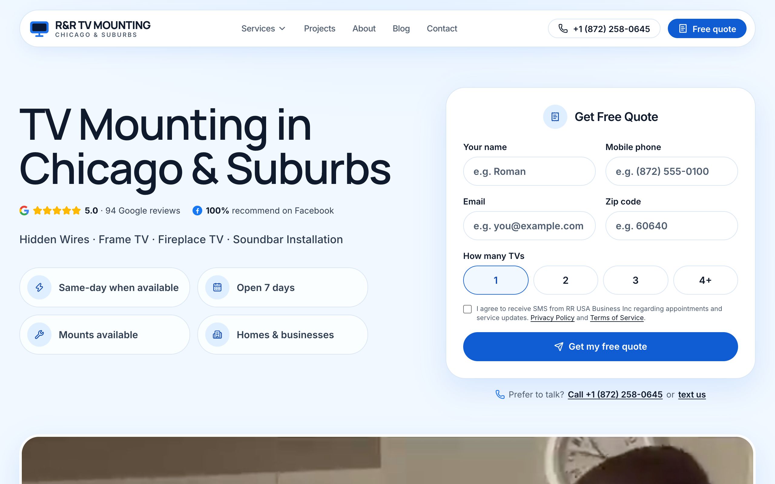
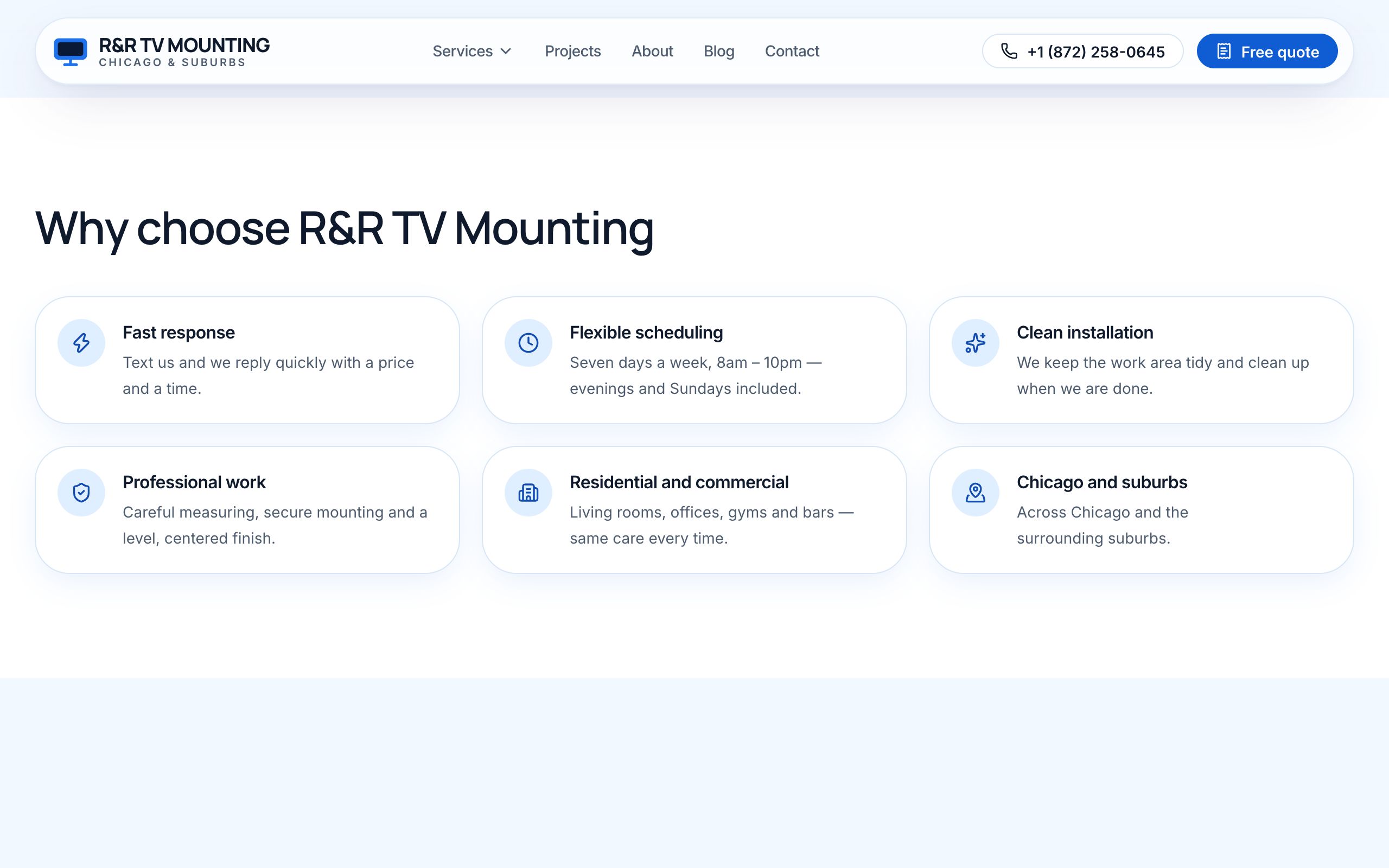
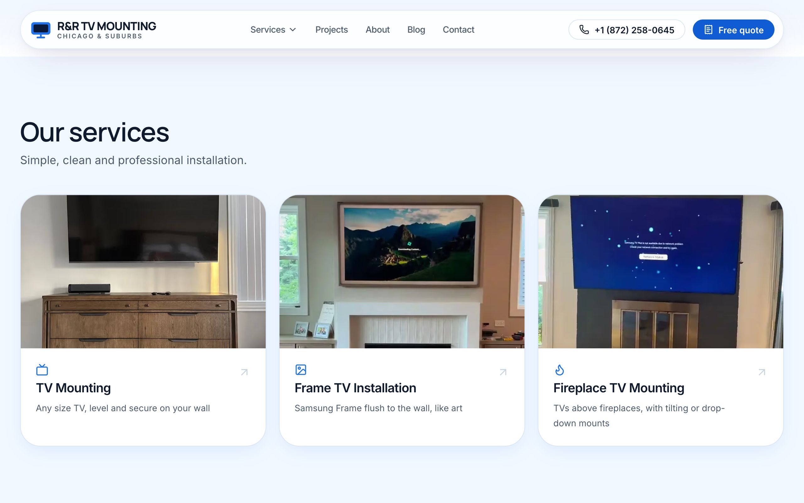
We designed one visual language for R&R — five colours, two fonts, one style of button and card — so every page looks like the same business.
What we did
- Five colours, fixed: a light blue page, white cards, dark navy text, one blue for every button and link, and a deep navy only for the footer.
- Two fonts: Manrope for headings, Inter for reading. No shouting capitals, no tiny grey text that is hard to read.
- White cards with a soft blue glow, taken from the old site so it still feels like R&R.
- One button shape — a rounded pill — in three sizes, each with a meaning: small in the header, medium inside a card, large for the main action of a section.
- One way of answering the mouse: cards light up with a blue edge, photos get a blue wash with an arrow, buttons swap their colours. A customer always knows what is clickable.
- A quality bar every page had to pass before it was shown: checked on a computer and on a phone, readable contrast, usable with a keyboard.
| Colour | Used for |
|---|---|
Light blue #f4f8ff |
the page background |
| White | cards, header, form fields |
Dark navy #0b1d33 |
all text |
Blue #1769e0 |
the only accent: buttons, links |
Deep navy #0f2d56 |
the footer only |
Buttons:   [ small ]   [  medium  ]   [   LARGE — main action   ]
Hover:     card → blue edge + glow    photo → blue wash + arrow    button → colours swap
How it looks
Why it matters
A consistent look makes a small business look established — and it let us build 38 pages quickly without each one being designed from scratch.